ECOZEAN
FRONTEND / UX, 2022
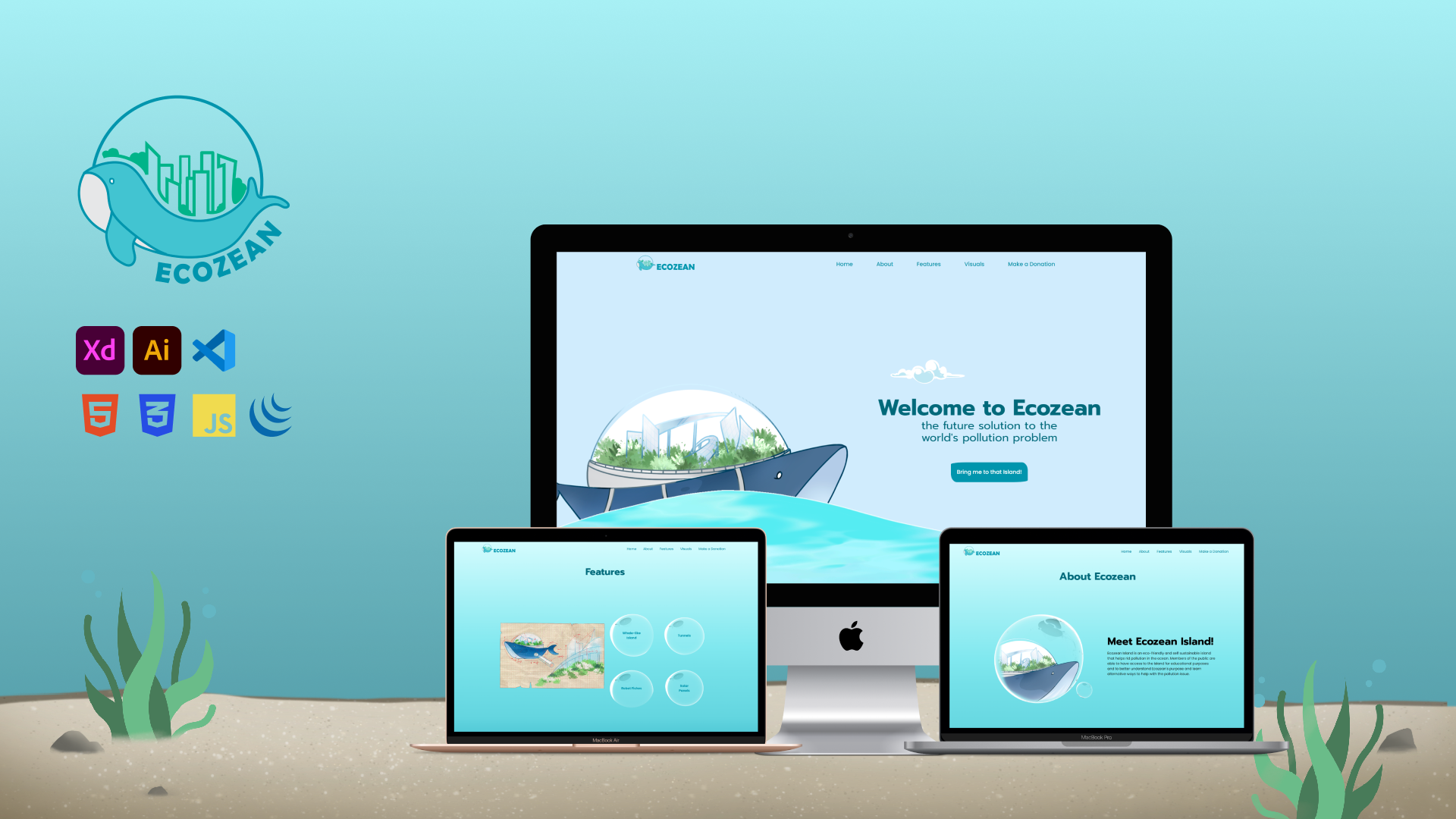
Ecozean is a fiticous eco-friendly and self-sustainable Island that combats the ocean pollution. Members of the public are able to visit the island for educational pruposes, to understand Ecozean's purpose and learn alternative ways to help with the ocean poullution issue.
In this group of 4 project, I was in charge of coding the Microsite. I mainly use jQuery as the main framework and GSAP for animations.
Project Duration: 2 Weeks, Aug 2021


Branding Rationale
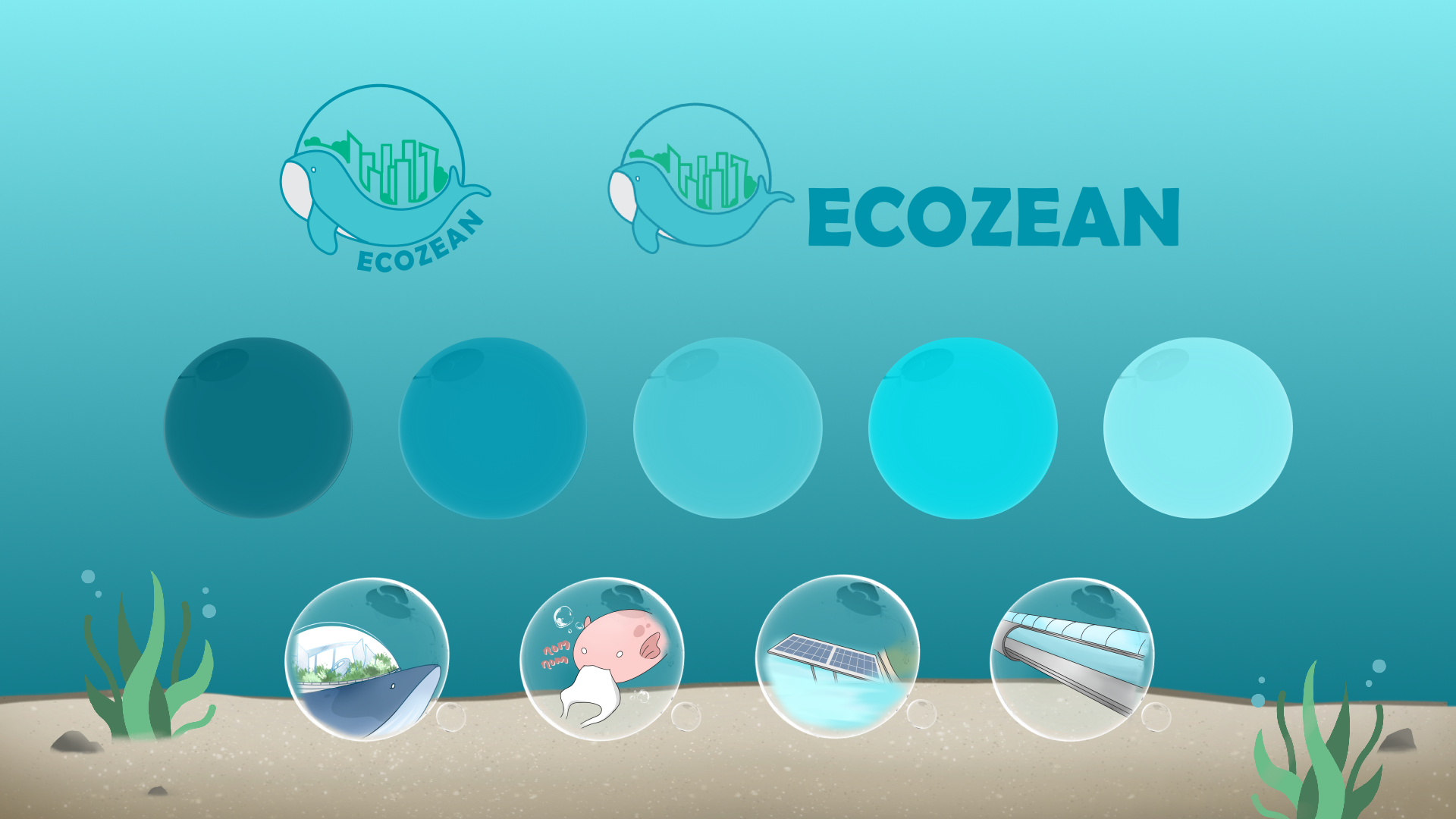
Brand Naming
Ecozean is derived from the combination of the words "eco" and "ozean" (ocean in german translation). The defination of word "eco" is to not harm and protect the environment. As our focus is to tackle Ocean Pollution, we would also need to think of ways that will not harm the ecosystem of the ocean.
Graphics in Logo
The Logo is made up of 3 parts: the Brand Name, the Whale, a Green City.
The Whale represents the whale-shape islands, Ecozean Jr. The islands use biomimicry design from whale.
The Green City represents the sustainable city on the islands.
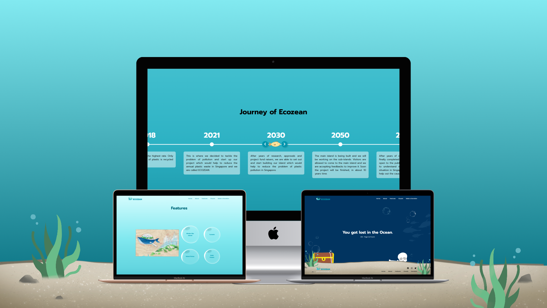
GALLERY
Click the image to enlarge the view